In Summer 2019 we announced an Instagram contest to win a personal branded style from the creative studio Integma Creative Hub. There were over 100 entries, with the winner announced as the Moscow Region Blood Service. We worked on this project with particular pleasure, given that there are more than a few donors working in our team.
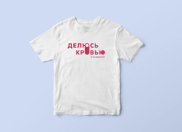
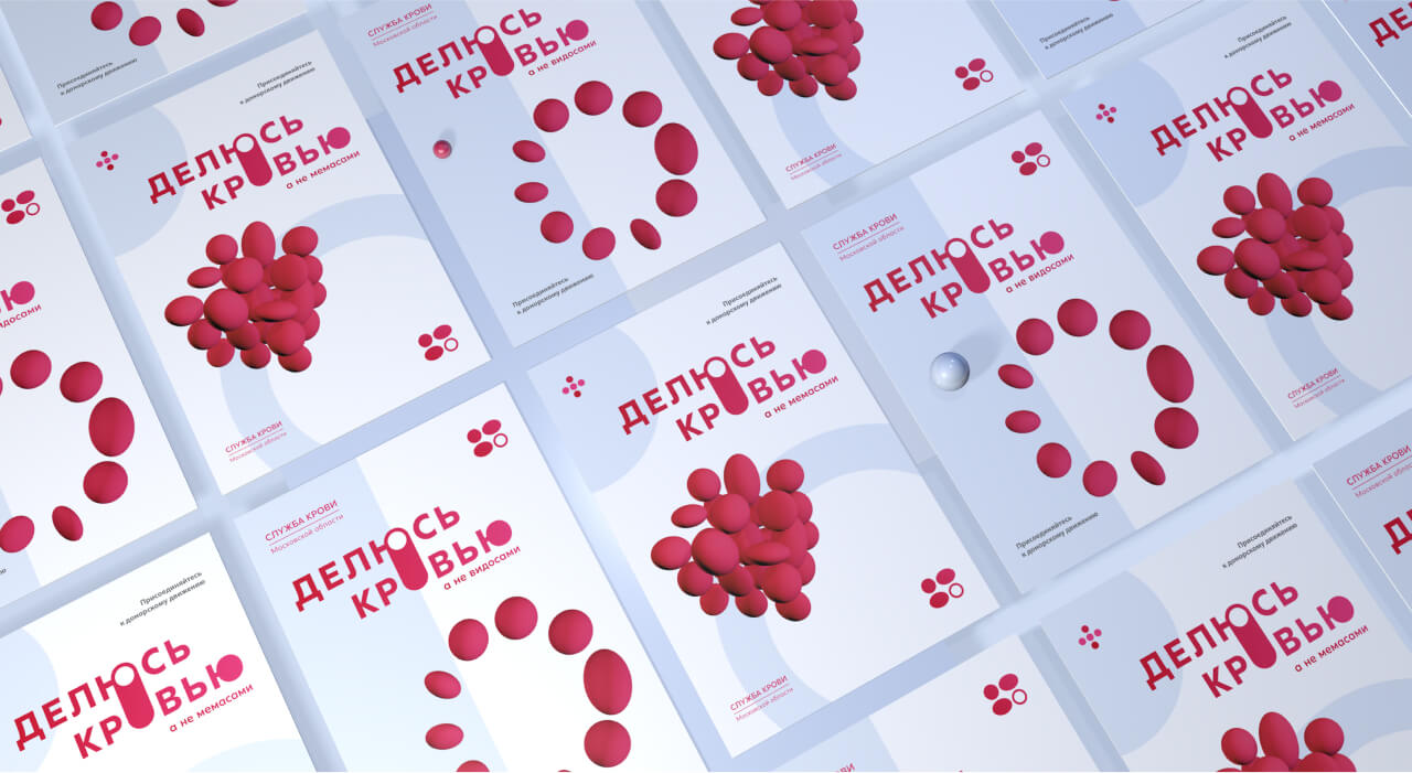
Blood donors are predominantly people over age 35, with the percentage of younger donors being negligible. When creating a corporate brand for the Blood Service, we gave ourselves the task of developing visual solutions that would attract the attention of younger audiences and pique their interest in the topic of becoming a donor.
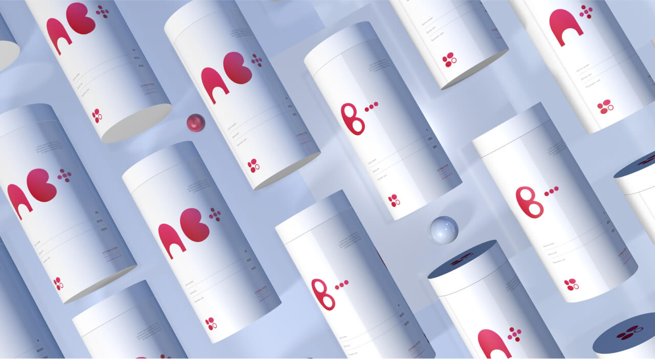
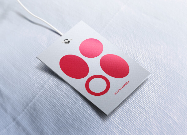
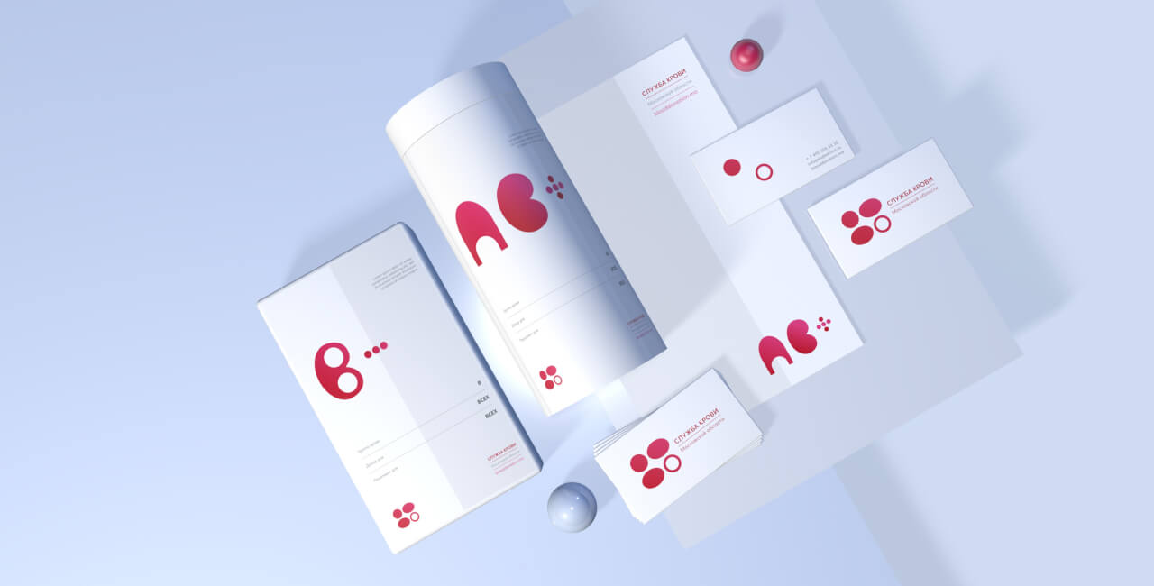
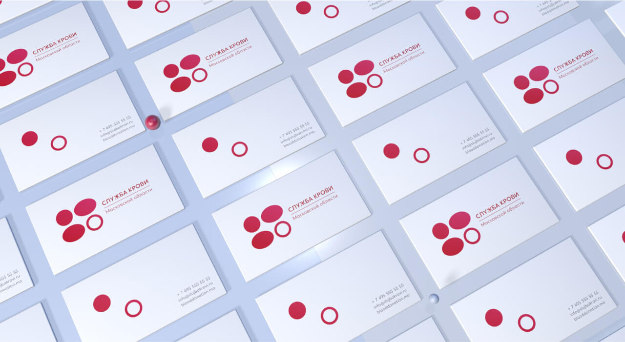
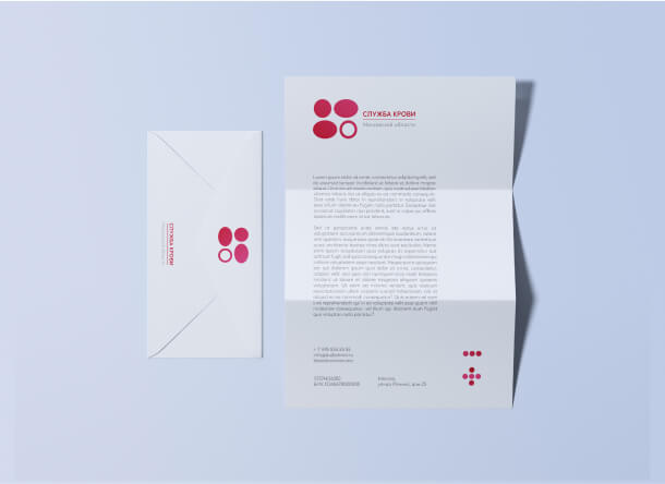
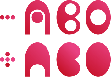
The new logo symbolizes the 4 main blood types; the elements themselves resemble the outlines of blood cells. The "cell" not filled out with color speaks to the fact that there is always at least one person nearby who needs donor blood. Part of our inspiration came from the understanding of the "donor traffic light": a system that, when in online mode, shows what type of blood there is a lack of in any given region.
The classic red is perceived by many as alarming, and many are even frightened by it. In order to avoid such an effect, we diluted the color of the blood with a bit of the life-affirming color magenta, and as a background hue we chose light blue - a color of hope and future.
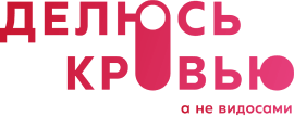
For the social advertising campaign focused on young audiences, we developed slogans calling people to share what is actually important.

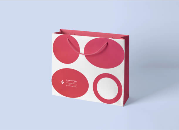
When designing packing materials and documents, we developed graphic symbols that indicate the different blood groups. Thanks to the smooth lines and rounded format, they appear calm and well-balanced.