Medford Medical Solutions, a distributor of high-tech medical diagnostic equipment, has been operating on the Russian market since 2009. As part of their rebranding strategy, we carried out a comprehensive project on re-visualizing the brand and created a logo, slogan, color scheme, and font solution, as well as visualizing corporate identity media and creating a brandbook.
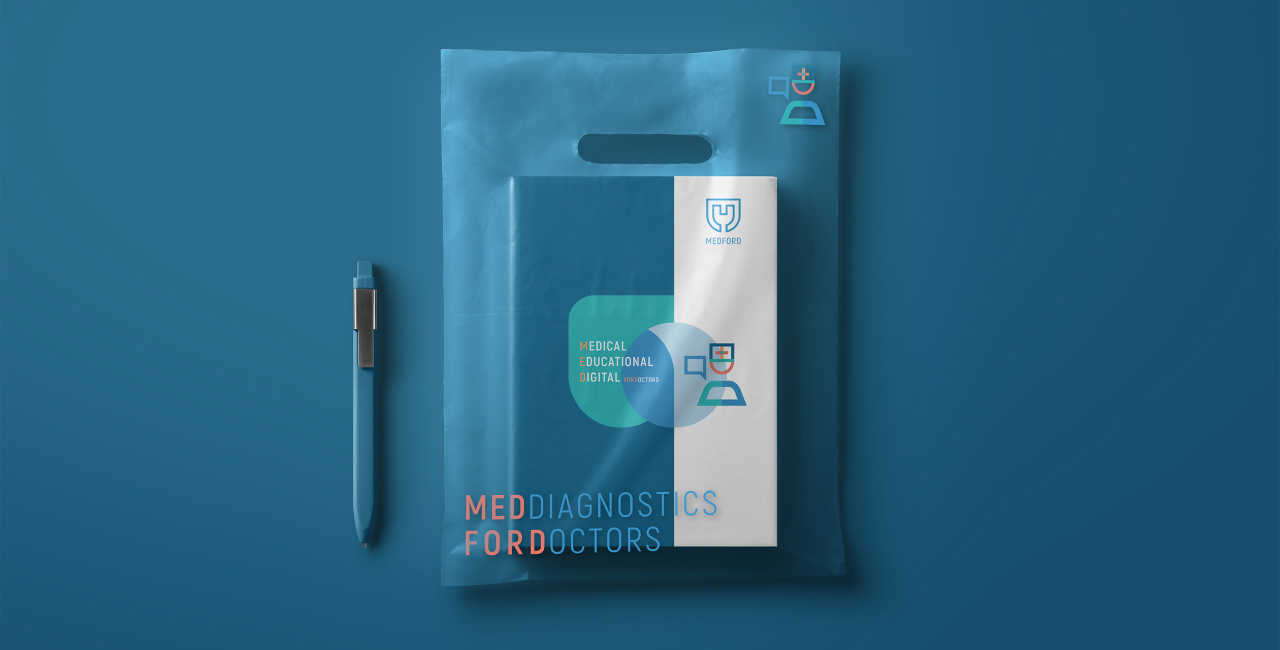
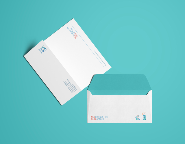
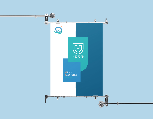
The new logo is a coat of arms using the first three letters of the brand name (MED) connected to an electric plug - a symbol for connecting to the network. The word "network" here has two meanings: the familiar electrical one, used for powering equipment, and network as the personification of the medical community, united by Medford.
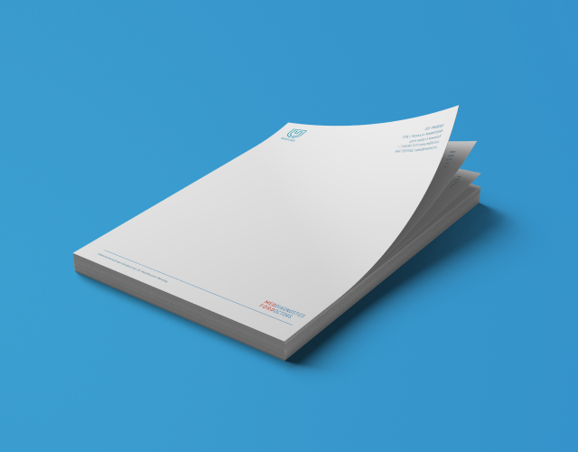
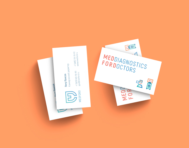
The main color combination is a blend of white, light blue, turquoise, and dark blue, with coral chosen as an accent color. White plays a large role in the brand's image by adding lightness and making it modern.


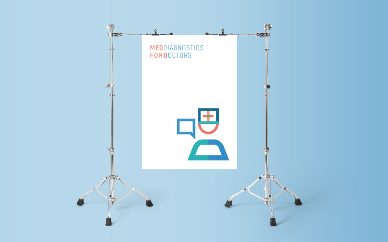
The company slogan — MEDDIAGNOSTICS FORDOCTORS — is now not only a new way of communicating the brand's full name, but also reflects its main area of activity.

We also laid the foundation for further development of the brand and the formation of sub-brands: an educational platform for doctors, regional associations, and other company projects.

The icon set illustrates every stage of interaction with doctors and medical centers.